UI Design · Mobile-First · Cross-Browser

UI & Responsive Design
an interface that feels right on every screen

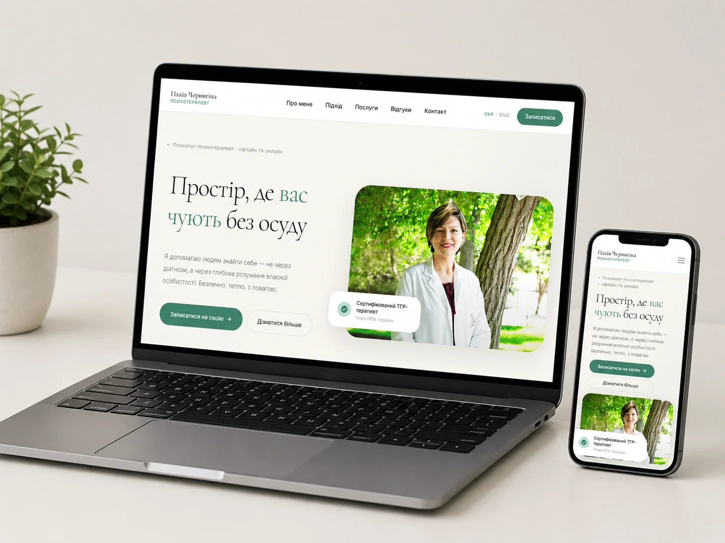
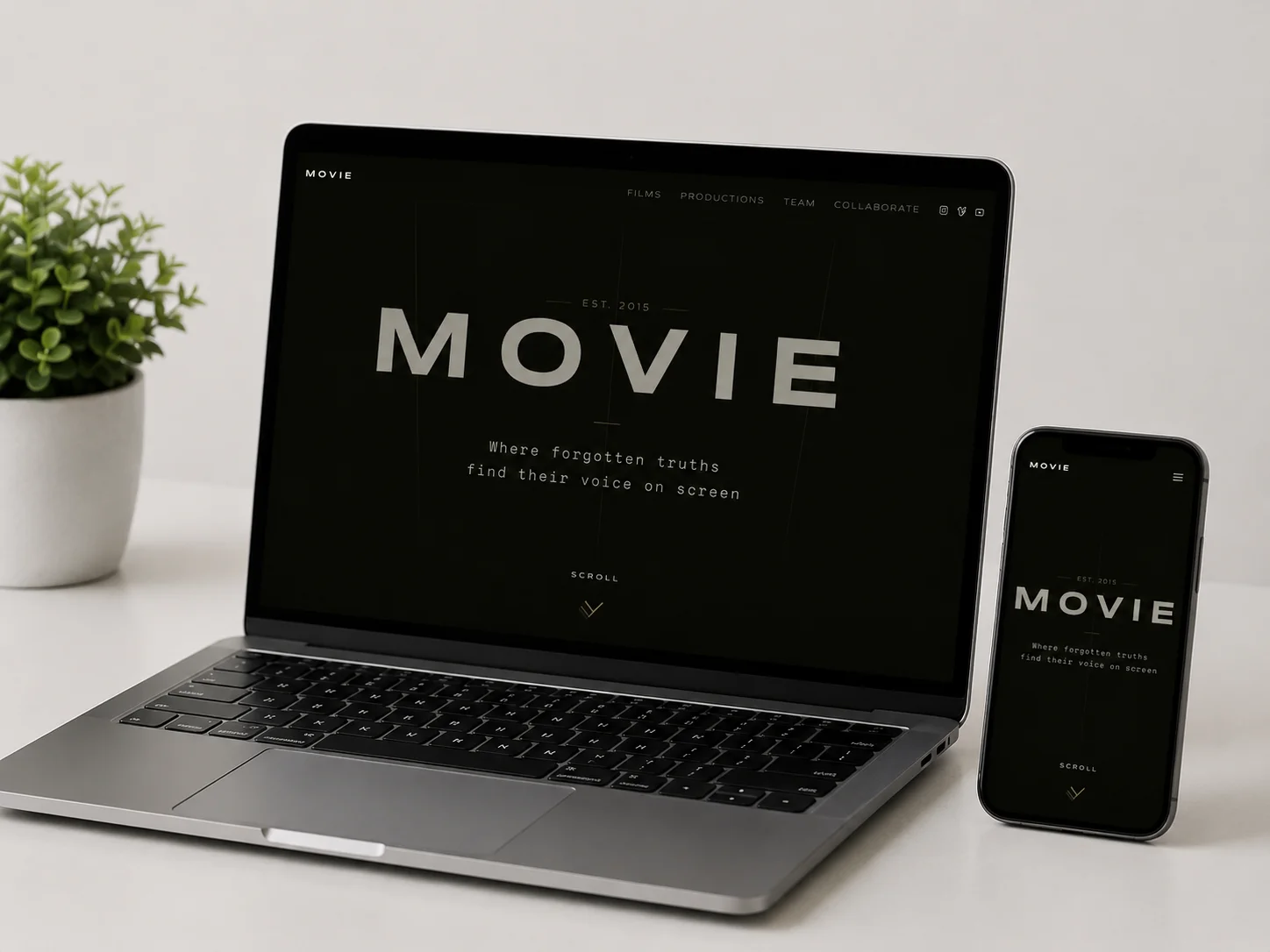
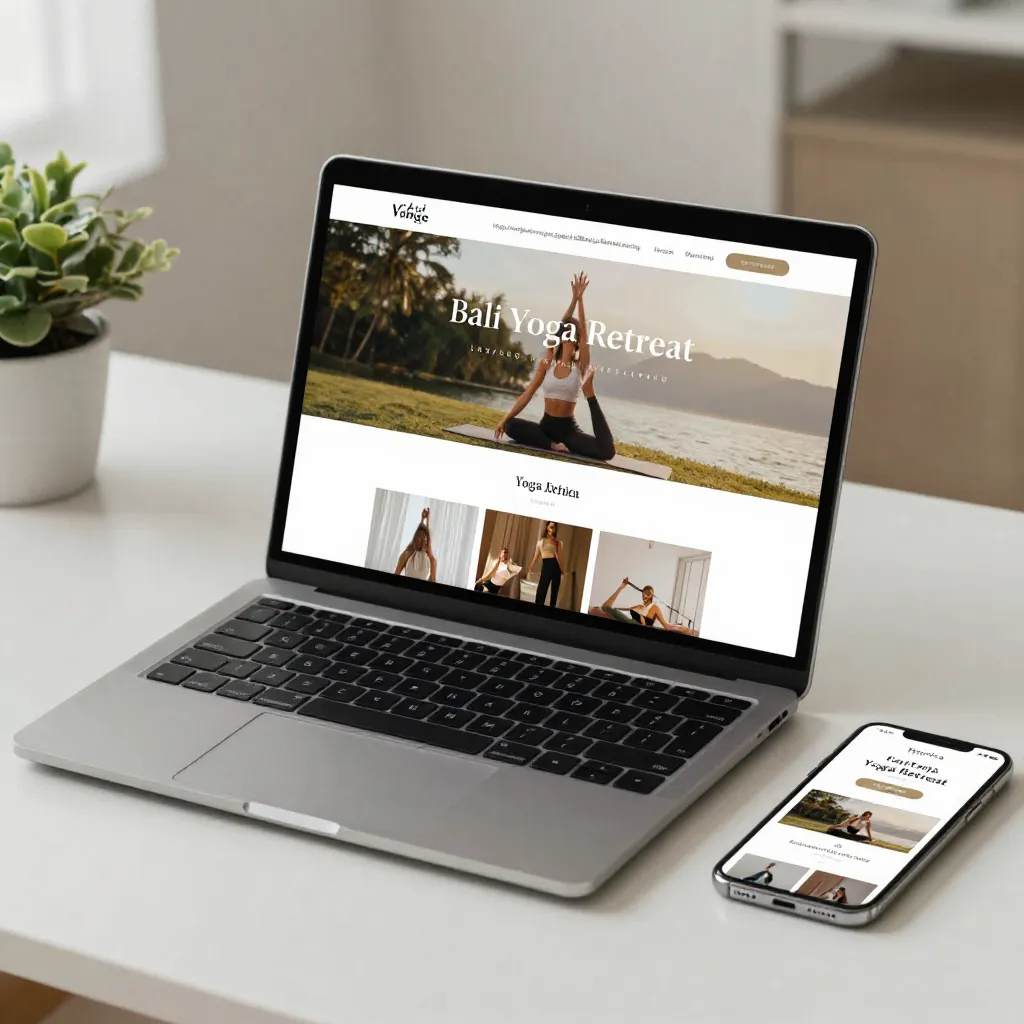
We design thoughtful UI and responsive layouts that look just as good on a phone, tablet, or desktop. Every element is checked on real devices and across different browsers - not just in an emulator.

UI & responsive design means an interface that works everywhere

UI design defines how a site's elements look and behave - buttons, forms, cards, navigation. Responsive layout makes sure that interface rearranges correctly on any screen, from a small phone to a wide desktop monitor.

Mobile-first Designed for phones first
100% Responsive on every screen
Chrome / Safari / Firefox Cross-browser tested

Situations where UI & responsive design really matter

When an interface looks inconsistent or feels clumsy across devices, it directly hurts trust and conversion.

The site breaks on mobile

  • Elements overlap each other
  • Buttons are hard to tap
  • Text gets cut off or stacked wrong

An inconsistent UI

  • Buttons and forms all look different
  • No unified design system
  • Visual chaos across pages

Problems across browsers

  • The site looks different in Safari vs Chrome
  • Elements shift out of place
  • Hard to pin down where the bug is

You need a design system

  • Reusable components
  • Consistent colors and typography
  • Easier to scale the site

Before a rebrand

  • Refreshing the visual style
  • Aligning with a new brand
  • A new look without rewriting the code

Before frontend development

  • A finished design ready to build
  • A clear component structure
  • Fewer revisions once coding starts

When a different solution makes more sense

UI & responsive design is about the visual side of a site. If your need is different, one of our other services may be a better fit.

The design is already done

You need a website from scratch

Speed is the issue, not design

  • You're happy with the design, it's just slow
  • Needs work on code and server settings
  • Better suited to website optimization

End-to-end UI & responsive design - from audit to finished layout

We handle the entire interface design process, so you get a consistent, user-friendly design for every screen.

UI audit

  • Reviewing the current interface
  • Spotting visual inconsistencies
  • Testing across devices

Visual design

  • Custom visual style
  • Color, typography, icons
  • Aligned with your brand

Responsive layouts

  • Mobile, tablet, and desktop
  • Flexible grids and breakpoints
  • Verified on real devices

Component design system

  • Buttons, forms, cards
  • Reusable building blocks
  • Consistency across every page

Cross-browser testing

  • Chrome, Safari, Firefox, Edge
  • Real mobile devices
  • Fixing inconsistencies

Accessibility

  • Color contrast and readability
  • Correct keyboard navigation
  • Baseline accessibility standards

A transparent process -
from audit to finished layout

At every stage, you know exactly what's happening with the project and sign off on the result before we move forward.

  • UI audit

    We review the current interface and flag problem areas.

  • Design concept

    We propose a visual direction and component structure.

  • Responsive layouts

    We build versions for mobile, tablet, and desktop.

  • Device testing

    We verify the result across browsers and on real devices.

Portfolio · Selected Work

Interfaces designed
for every screen

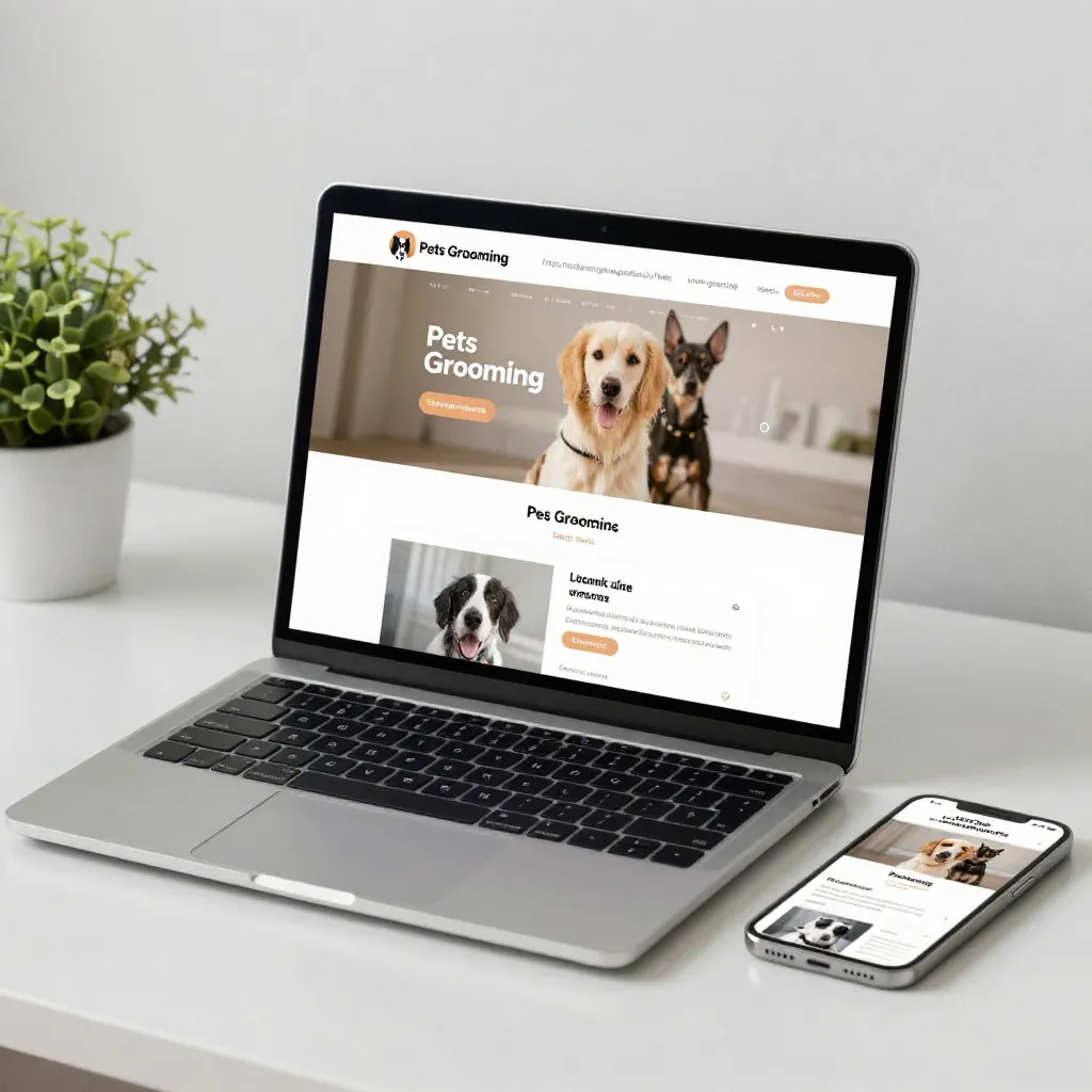
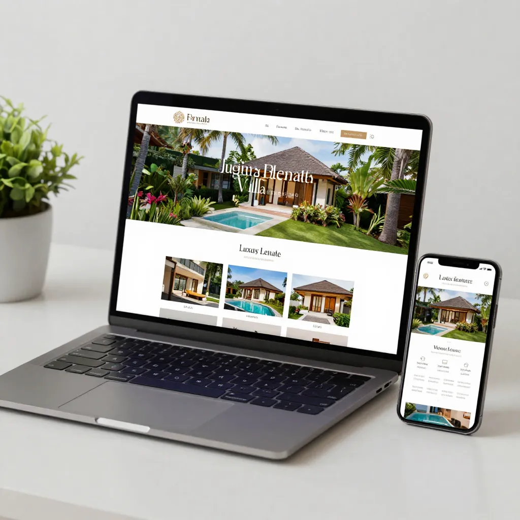
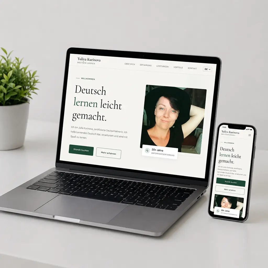
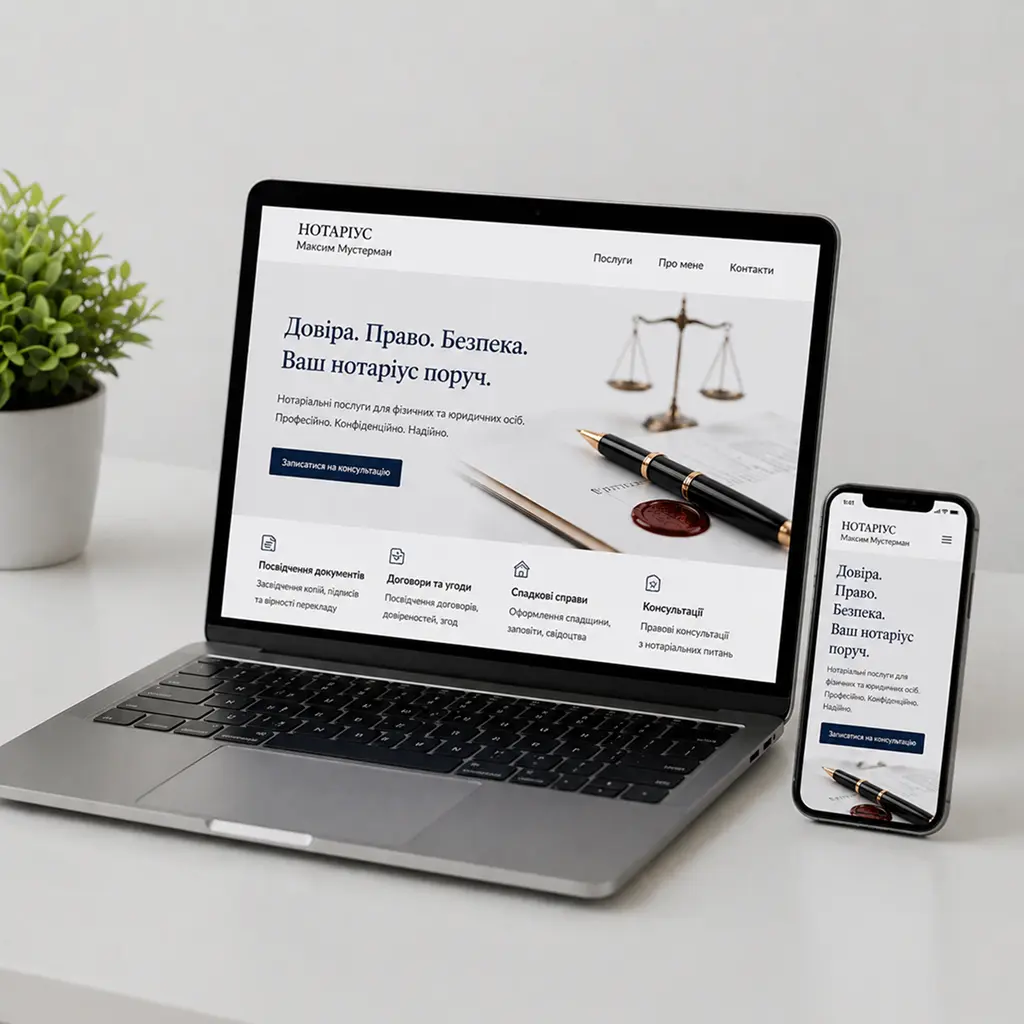
Explore real examples of landing pages and business websites - from service-based companies to high-end real estate projects. Each interface is adapted for mobile, tablet, and desktop with close attention to the small details.

We use the most suitable approach for each project - from flexible platform-based solutions to fully custom UI built around your business goals.

UI & Responsive Design Questions

Responsive design means a website's layout automatically adapts to the screen size it's viewed on - phone, tablet, or desktop. Elements rearrange so the interface stays usable on any device.

The cost depends on the number of unique screens and the complexity of the components. We give an estimate after reviewing your project or brief.

Yes, we test that the site works correctly in Chrome, Safari, Firefox, and Edge, as well as on real mobile devices - not just in emulators.

Yes, we can update the visual style and responsiveness of an existing website without a full rebuild, while keeping your content and structure intact.

Where it's useful, yes - we organize reusable components (buttons, cards, forms) into a single design system so the site stays consistent as it grows.

Yes, we follow baseline accessibility principles: color contrast, readable text sizes, and correct keyboard navigation.

Ready to talk about
your site's UI?

Tell us about your project - we'll take a look at the current interface and suggest a plan.

Message us